
Sitting in Boston Logan International Airport after another fascinating few days spent at the MIT Sloan Sports Analytics Conference, I found myself thinking about accessibility. For all the great work being done to further sports analytics, and thinking, much of what was presented at Hynes Convention Center requires you to know something about something in order to process the data in front of you.
And in order to even discuss Sloan, its important to know something about it.
Its whatever you want it to be.
Well, thats not entirely true. Sloan is a think-tank. Sloan is a social gathering. Sloan takes place in one long hallway, from which stems a series of side corridors, each housing a number of large, brown double doors. Behind every set of doors is an option, and when you take one option you lose the chance at two, three or four others. When its impossible to see everything, you have to choose your own adventure.
Behind one door you might find Drew Carey explaining the method with which his MLS team, the Seattle Sounders, enables fans to vote out their General Manager every four years. In that same seat an hour later, Jeff Van Gundy speaks to how little control a coach has once the ball is in the air, and the importance of choosing which numbers to communicate to players.
Next door, theres Dean Oliver saying, "In basketball, the efficiency that matters is how efficient you are with your possessions, while Bill James professes the power of the consensus in changing box scores.
Down the hall, Matthew Goldman and Justin M Rao present their findings on how pressure affects the performance of NBA players (home teams shoot slightly worse from the free-throw line in clutch situations).
Behind yet another door youll find ESPNs Kevin Arnovitz waxing poetic on a different sort of efficiency. How to best get people from their cars to their seats, from their seats to their cars and from their cars to home.
Some rooms are better at making you laugh. Some make you scratch your head. Theyre all interesting, but the best are those that are able to convey new, intriguing data in the most accessible way possible.
SPATIAL ANALYTICS
Perhaps no other person had accessibility more in mind than Kirk Goldsberry, an assistant professor of Geography at Michigan State University. Goldsberry attempted, in short, to analyze how teams and players and, in his words, to translate these results into forms effectively communicated amongst diverse audiences.
Essentially, Goldsberry wants anyone to be able to look at his work and know what is says.
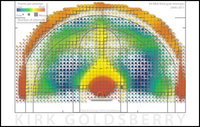
Looking at the visual on the right, you decide whether he accomplished that.
Its tough to overstate how important this is. Sitting in on eight research presentations over the course of two days, you quickly begin to ask yourself two questions: Is this applicable to the real world? Will people understand this with minimal verbal or written explanation?
To the second question, the visuals, which are extremely similar to heat maps for hitters and pitchers, are easy to digest. Goldsberry broke the offensive portion of the floor down into 1,284 cells, with the hot or coldness of each sections representing how many points are scored per attempt from that cell, making it fairly simple to tell the difference between, say, Shane Battier and Dwyane Wade.
And because the data is intuitive what players are effective from which zones of the floor the easy to pick up visuals are applicable for just about any audience.
Goldsberry went on the calculate a Range Percentage for every player in the league, which determines which players score at least a point per attempt from the most cells on the floor. Not surprisingly, Steve Nash and Ray Allen topped the charts, each of them effective from over 30 percent of the floor, with LeBron James falling just outside of the Top 10 (23.9%).
There are limitations, which Goldsberry readily acknowledges. Using one point per attempt as a baseline for Range Percentage is likely too limiting, while the visuals can easily be skewed by sample sizes. A five-year visual might be very accurate, but it doesnt tell you much about how tendencies may have changed for the season being looked at. On the other hand, only using data from a single season might not produce a chart with much to say.
But for what Goldsberry presented, accompanied by appropriate context, his work was the most ready to plug-and-play into both media and scouting reports.
Rather than interpreting existing information, others attempted to redefine our definitions of positions and the concept of fit.
BIG THREES, SYNERGIES AND REDEFINED POSITIONS
Point guard. Shooting guard. Small forward. Power forward. Center.
Everyone knows how we current classify players by position. We might move a step further in certain venues, but in both media and casual conversations we still wind up trying to determine the best players at those five positions. Or, in evaluating possible trades, we say things like, Where can this team get a shooting guard, and, This team has three good point guards, maybe they can trade one for a power forward.
Of course, that might be all those traditional definitions are good for these days. That, and streamlining lineup cards.
Though it wasnt their explicit intent, three research papers at Sloan dealt directly with re-distributing players across new categories and using that newly formatted data to answer various questions regarding how players fit with one another.
The first presenter, Robert Ayer (2011 MBA from MIT Sloan School of Management), used a technique called clustering to create 14 distinct player types based on statistical performance naturally, with the Sloan audience, Ayer drew some criticism when it appeared he didnt use per-minute numbers, but he said after the presentation that since he weighted minutes in his formulas, his data wound up the same as if he had calculated for minutes beforehand (still, any player comparison study eventually needs to adjust for pace).
Examples of Ayers clusters included:
Cluster-2: High scoring, dynamic guards
Cluster-4: Wing 3-point shooters
Cluster-9: Pass first, low scoring point guards
Cluster 12: High scoring post players, high rebounds, high blocks
Some complicated math later I dont mean to gloss over some very hard work, but you can read the papers if you want details on the process and Ayer was able to conclude which types of players fit into the most and least productive Big 2s and Big 3s. A pass-first point guard coupled with two dynamic power forwards was a huge negative, for example, while pairing a high-scoring, high-assist point guard like Isiah Thomas with a multi-faceted wing (Paul Pierce) and a high-scoring post player (Shaq) produced the most positive results.
Those multi-faceted, three-point shooting wings think Danilo Gallinari fit with more groups than any other cluster, actually. So if youre trying to build a Big 3, according to Ayers findings, you cant go wrong starting with a dynamic small forward.
Later, a paper by Eugene Shen along with Allan and Philip Maymin (NYU-Polytechnic Institute) took a different route to like-minded conclusions, riffing on Advanced Plus-Minus how a team performs with a player on the court, adjusted for a ton of variables to create Skills Plus-Minus.
The idea was as simple as the calculations were deep. Take player names out of it, which skillsets fit best next to one another. After determining skillsets by simulating games with one players alongside a team of replacement level players against a team of replacement level players LeBrons team won by 15 point per game on average in these situations some of the groups findings were that putting two players good at stealing the ball in the same backcourt produced a positive synergy while two scoring players produced poor synergy because only one could shoot the ball at a time.
Not surprisingly, with these designations, the Miami HEAT had the worst team synergy in the league with Dwyane Wade, LeBron James and Chris Bosh the Orlando Magic had the best, surrounding a rebounder with shooters and ballhandlers which Shen theorized winds up not mattering because of the extremely high individual SPMs of those players.
Finally, Muthu Alagappan visualized teams as what I called constellations, which you can see below.
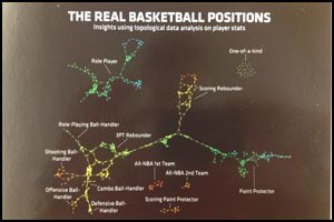
As with the earlier studies, these constellations sought to categorize players based on statistics. Though these categories were less defined than those of Ayer, I found them somewhat more descriptive if only because there was a place for LeBron, the One of a Kind player.
But as nice as Alagappans images were, after all three of these presentations I was left thinking, Why are we pigeonholing players even further? Why do 13 or 14 positions make more sense than five? How is this applicable to the real world.
*I should note here that aside from grouping players, something like Skills Plus-Minus has potential particularly in draft prospect evaluation along the same lines as what is used in baseball, where someone can have plus power (say a 70 on a 0-80 scale) or minus fielding.
Maybe its because Ive always been interested more in What a player does well as opposed to What a player does as well as someone else, but it would seem that on a team level, analytics that help to exactly define what is unique about a player are far more useful than those that try to make them seem more alike.
Unless, that is, one of your player types is, 6-foot-9, 40 percent three point shooter that fights through picks but struggles in isolation against ballhandlers but excels at ball denial and defensive rebounding while playing three different positions.
Which brings us to what I found extremely lacking at the conference this year: defense.
OPTICAL TRACKING DATA
When your analytical calculations claim to encompass every aspect of the game, and yet the defensive statistics being used are blocks and steals, theres a problem (using advanced +/- is getting somewhere). Blocks and steals, like defensive rebounds, are the results of defensive possessions, but they do very little to describe a players overall impact on a teams ability to stop another team from scoring.
In fact its very possible to be an excellent shot blocker or rebounder and still be a below-average defensive player.
This is a bit of a Holy Grail discussion for stat-heads. How do we quantify defense? Thanks to Synergy Sports we have per-possession defensive numbers, based on video, that have been a fantastic start to defensive analytics, but they are still lacking almost as much context as something like raw plus-minus. How well contested were those spot-up opportunities give up? How tough were the shots the ballhandler was hitting out of the pick-and-roll, and were they shots the defense was giving up in order to cut off more valuable passing lanes? Has a player been giving up a large number of points because he is trying to cover for teammates gambling in passing lanes, and thus involving himself in more possessions at a disadvantage?
We might soon have a better picture of this thanks to the SportVU Optical Tracking System from STATS, LLC.
The SportVU system cameras a team pays to have placed around its arena was unveiled at Sloan a season ago, and this year the team of Rajiv Maheswaran, Yu-Han Chang, Aaron Henehan and Samantha Danesis (all from the University of Southern California) used the data from the system (which looks very much screenshots of The Matrix before manipulated) to take a look at rebounds.
The conclusion was perfectly logical. The closer the location of the shot is to the rim, the more likely the offensive team is to grab the rebound, with six foot shots being recovered 36 percent of the time. Interestingly, though the further out the shot is the less likely it is to be recovered by the shooting team, once the shots become three pointers the offensive rebounding percentage spikes up again.
Essentially, if you want to get the ball back, the worst shot you can take is a long two-pointer. If there were any more reasons not to take those.
While I encourage you to read the paper, this is only the start of what SportVU can do, the equivalent of the first photograph to, say, Raiders of the Lost Ark. Imagine, for example, cameras that film every possession, and then illustrates a digital playbook for each game, as in this visual from Maheswaran's study:

Want to know exactly how close Shane Battier was to Kobe Bryant when Bryant had the ball during the HEAT-Lakers game the other day? It can tell you that. Want to know how quickly a player accelerates after being screened, and thus how fast he recovers to the offensive player? It can tell you that. Want to know who the best close-out players in the league are? Eventually, well know that too.
What SportVU wont give us is an all-encompassing statistic for defense, the sort you can bring up in a bar to emphatically prove the superiority of one players defense over anothers. And thats OK. Someone else can do that in the future, and people will find it valuable. But to teams, data reigns, and the more specific data they have, the closer theyll get to being able to define exactly who an individual player is.
We arent there yet. But every year, the Sloan Sports Analytics Conference shows us how close were getting.
invisionApi.writeCommentsByGuid('https://www.nba.com/heat/news/the_2012_heatcom_sloan_report_120305.html');