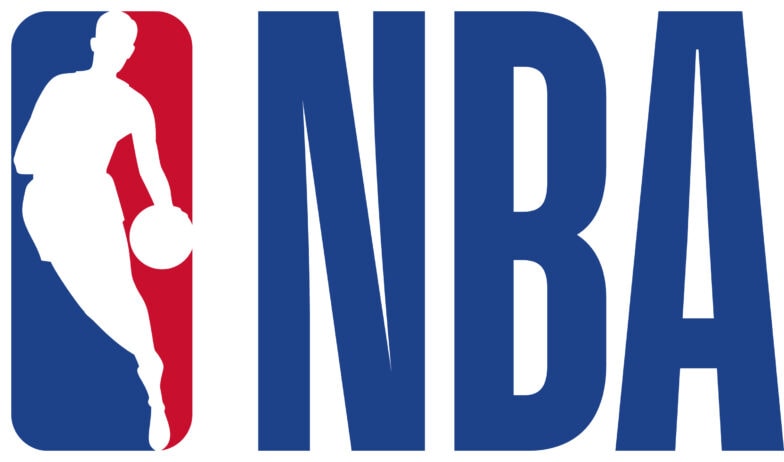
As a growing league around the world and online, the NBA is refreshing its logo used on everything from merchandising and apparel to digital and social media assets. This marks the first such update in 48 years.
The core logo, which debuted in 1969, will remain essentially the same with slight changes to its typeface and colors. A modified version of Action font, customized for the league, will be used for the letters N-B-A in the primary logo. The taller, leaner typeface embodies the NBA game and its athletes. The logo’s colors will also feature richer hues of red and blue for enhanced visibility on all NBA assets.
In addition, the league’s secondary logo (see below) will also be updated to incorporate the revised typeface and colors with the letters N-B-A alongside logoman.
“This modernized look strikes the right balance between honoring our iconic logo and allowing us to be consistent and further adapt to changing digital and media landscapes,” said NBA Chief Marketing Officer Pam El.
The primary logo will first appear at the 2017 NBA Summer League in Las Vegas, which begins on July 7. Changes will continue to be implemented on a rolling schedule.
The global refresh will also include an update to the collection of logos used on NBA digital and social media channels as well as in broadcast, at events and on merchandise. Due to long-lead manufacturing timelines, team uniforms, apparel and equipment for the 2017-18 NBA season will include the original NBA logo.