By: Alex Kramers

For the last 18 years, the Sacramento Kings have been defined by a royal purple, black and silver identity, featuring a multifaceted logo comprised of two elongated lances behind a centered crown and basketball base. But during the revolutionary brand change in the mid-1990s, in which the Kings replaced the familiar blue-and-red color scheme that had been a franchise staple since 1971, the team nearly opted for a burgundy, gold and black palate.
In fact, Tom O’Grady, who was hired by Commissioner David Stern as the NBA’s first Creative Director in 1990 and orchestrated the creation of 20 of the 30 NBA teams’ re-branding initiatives, reveals he and Michael McCullough, the Kings then-Vice President of Marketing, faced an arduous back-and-forth process in which the team rigorously sampled both purple and burgundy merchandise.

“The Sacramento Kings were very close to having the (current) Cleveland Cavaliers colors of burgundy, gold and black,” says O’Grady. “It was a toss-up for the team right until the end.”
In addition to facing an immediate problem with color sourcing – the NBA’s former clothing manufacturers, Starter and Champion, sent cardinal and maroon samples instead of burgundy – the fact the local San Francisco 49ers already had similar colors ultimately swayed the team towards purple.
“The 49ers darkened their color scheme at the time, and I think (the Kings) felt, although it was a really cool color palate, it was going to be too much (like) the 49ers,” says O’Grady. “(They thought), ‘We’re doing this change, let’s just do something different here,’ and so the burgundy, gold and black went away.”

While purple was ideally suited for the Kings due to its royal heritage, part of the inspiration behind the new look also stemmed from the team’s affinity for the colors of one of Major League Baseball’s 1993 expansion teams.
“The Kings liked the Colorado Rockies color scheme – their sales were very, very strong from the start,” says O’Grady.
“Black had a strong run of success starting with the Oakland Raiders and MTV videos back in the late '80s, and many teams in the NFL, MLB, NHL and NBA were bringing black into their color schemes.”
Once the Kings settled on purple, black and silver, O’Grady conducted research on royalty and heraldic shapes, and came across numerous symbols depicting the cross elements of warfare and the figurative protection of the king.
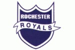
“We actually liked the shield shape and banner from the original (Rochester) Royals logo, but did not want to ‘retro-fit’ the new mark – so we included similar elements but not the same shapes,” he says. “The crown and the font-styling support the royal concept.”
The first prototype, however, proved to be a bit too edgy.
“We had short, blunt swords in the original design,” says O’Grady. “They were almost like warrior swords you’d see the gladiators with – they weren’t the elongated lances that you see in the (final) logo.
“The swords were much tougher looking, but it was agreed that they were simply too aggressive.”
O’Grady simultaneously worked on creating the alternate ‘SK’ logo, which was inspired by the work of well-renowned graphic designer Neville Brody, and reveals he initially tried to incorporate elements of the secondary mark into the team’s primary logo.
“We actually tried to make some derivatives of that ‘SK’ (into) a primary mark and putting the ‘Kings’ around it, but it just wasn’t working – there was too much of a disconnect,” he says. “That was on the drawing table early.”
Since the finalized new logo was deliberately created by using multiple ‘peelable’ layers, meaning the ‘Kings’ wordmark could be easily reapplied on the front of team apparel, O’Grady promptly crafted the classic black team jerseys.
“That was not a very hard jersey to design – it’s black with some purple and silver, and we went with a pretty, simple, nice bold numeral font and had the purple panel on the side,” he says. “I thought it was great – it was plain and simple, and it worked for them.”
While the uniforms were introduced with minimal fanfare – Sacramento simply wore them on opening night of the 1994-95 season and issued a press release – they became instant hits with both players and fans.
“As I recall, fans almost uniformly embraced the change – the old logo, while charming, was dated and lacked the sophisticated look of the new identity.” says O’Grady. “As part of the Kings change, they added the still-very attractive ‘SK’ secondary logo and we created a very sharp, classy court design that has not changed that much since 1994.”

In the early 2000s, when then-Kings President John Thomas wanted to once again revitalize the team’s look, O’Grady spurred the intricate re-design of the uniform wordmark and created an entirely original font.
“(The Kings) asked us to provide a wide-ranging set of different uniform designs. We submitted some designs with the previous all caps ‘Kings’ jersey wordmark, and others with new font style,” says O’Grady. “The font was inspired by exploring what the lower-case font of the current logo font might look like.”
In addition to reinserting a crown atop the ‘i,’ which was prevalent in the original script, O’Grady added the sharply-swooping ‘g’ in the ‘Kings’ wordmark, revealing the first version instead included an extended ‘s.’
“The Kings font originally had the ‘s’ as a tail underneath the ‘ing ‘ – think all MLB jerseys – but we looked at it and thought it was a creative cliché and actually made the wordmark too busy,” he explains. “So I took out my sketch pad and fooled around with the ‘g’ with the truncated tail and added the pointy, almost saber-like effect.”
Yet, according to O’Grady, the trademark tilted crown on the back of the jersey, might actually be crooked by accident rather than by design.
“I think it was probably just someone without a design sensibility, ‘peeling’ off an element that really was intended for only one use, in this case just the ‘Kings’ wordmark,” laughs O’Grady. “I think the (Adobe) Illustrator shear tool could adjust this in five minutes.”
Looking back on his original re-design, O’Grady, who has since founded sports-branding firm Gameplan Creative in 2003 and works as a game producer for sports teams, remains proud of his legacy and his essential role in reshaping the Kings brand.
“It’s a really great compliment to do something you love, graphic design, in an industry you love, sports, and get to see these unbelievable athletes wearing things you poured your heart into to make them as cool, functional and interesting as possible,” he says, adding “It never gets” old to see the looks he created on TV.

If he were in charge of retouching the Kings logo today, O’Grady discloses he would make a few subtle changes, such as cleaning up the font and sharpening the lances, while keeping the main aspects of his influential design intact.
“I think I would probably stay with a similar shape … because I think it’s still very strong,” he states.
“Maybe I’d try something else because the purple and the black are so dominant – maybe add a different third color (such as) a softer blue that would be a little bit brighter.”
Nearly two decades later, it’s clear the Kings revamped identity has stood the royal test of time.